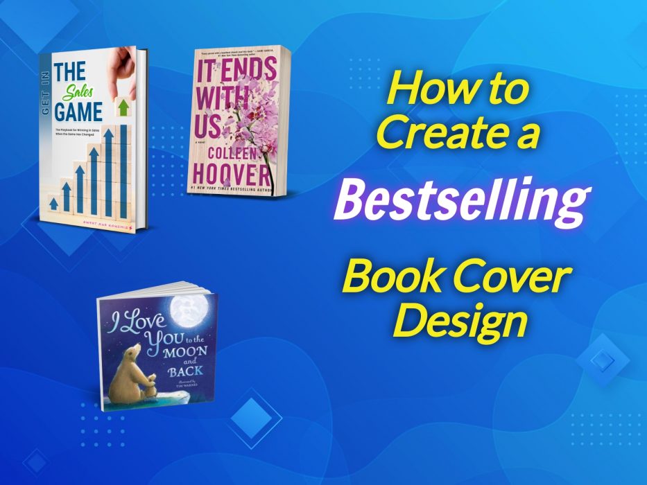
The greatest marketing asset of your book is its cover. It sells the book and raises its profile in the eyes of your potential readership. As a result, you must carefully select and coordinate every component of your book cover design. Never mind that you have little to no background in graphic art. With tools like BookBrush and Canva, you don’t need one.
In this post, you will learn the fundamentals of how to develop a well-illustrated facade for your work that appeals to your readers, communicates its topic and mood, and guarantees sales. A strategically chosen layout, typography, color scheme, and set of images all contribute to the overall quality of your book cover design.
The Elements of a Great Book Cover Design
Although a finished product may appear effortless, designing your book cover is not as simple as it seems. A lot of thought goes into it. So, let’s take a deeper look at the key elements of any bestselling book cover: imagery, typography, and color.
As industry experts may be quick to point out, a memorable, quality cover, including its imagery, will specifically target its readership. Bearing this in mind, you should make your book cover design as visually-oriented as possible.
The choice is yours. You decide the subject matter, the organization of elements and which ones you wish to highlight most. Your imagination can run wild. There really are no rules. Strive to be original. After all, it is your book cover design.
Be bold. Have a flair for the dramatic. Consider angles or uses of colors, fonts, formats, layout, photos, and sizes that have not been tried before. Consult your stock libraries. With a little ingenuity, you are bound to outshine your rivals with a spanking-new book cover.
The Title
If you are a new writer, you will want to leave a good impression with your readers by being clear about the nature of your work from the beginning. You can start with the title, an essential part of your book cover design. You will want one that encapsulates the subject or topic of your book.
The layout of your cover and your title join forces to inform your readers about your book without them having to read the description. Or, at least, they ought to. An example of a design that is oriented toward the subject matter and the title is the cover of a book about finance published in 2020 and provocatively titled You’re Making Other People Rich: Save, Invest and Spend with Intention by Ryan Sterling.
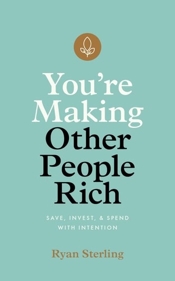 As the book is a nonfiction one about finance, the title and subtitle are conservatively laid out to occupy the middle portion of the cover.
The cover designer splits the title into “You’re Making” into lowercased white sans serif font at the top and “Other People Rich” into lowercased black sans serif font. The subtitle is in much smaller capitalized light black font towards the bottom of the cover.
Both the title and the subtitle are set against a light green mint background— appropriate for a book about finance or money, which is green.
There is no imagery other than a brown three-leaf logo at the top of the cover. The logo’s shade of brown is the same as that of the author’s name at the bottom of the cover.
The color contrast of white and black font highlights the conflict or irony of the reader seeking to conduct his or her financial affairs in a manner that benefits others more than himself or herself.
Forging your reputation through your covers among your audience pays off in the long run because, if you publish more work, your following will grow to know you better and come to expect a certain writing style, genre, or subgenre from you.
You won’t need to be as obvious about your chosen themes in your book cover designs the second, third or fourth time around as you release more and more work. Why? Eventually, your readers will have you pegged.
With each new release, you build your brand with your book cover designs.
Interesting Typography
In planning your book cover design, learning key terminology doesn’t hurt. For instance, you should be ready to weave interesting typography throughout your layout. Typography means the organization and visually oriented approach to the written content on your book cover.
As you may know, your book title and an author’s name are the most needed written content on your cover. This leaves the typography of your cover to dominate the remainder of the space— as it should. Since this is the case, your typography must truly drive the visual message home to your readers as to what your book is about.
 It all begins with imagery and text, not necessarily a quality font. You can use typography to back up your images or to defer to text on the cover.
In the publishing world, text is king. Blending written content with imagery is becoming more prevalent in book cover design. For instance, professional cover designer/critic/marketing professional Alexander Von Ness praised the topography of the cover of the coming-of-age, Christian fantasy book Journey to a Strong Tower: Higher Ways Book 1 by M.C. Spencer.
The cover’s design strongly communicates the genre of epic Christian fantasy adventure written for teens. The art suggests swordplay in the time of the medieval Christian crusades. Dominating the center is light and dark blue on and surrounding a young, dark-haired male crusader dressed accordingly and clutching the handle of a sword with the blade covering nearly half of his face past one eyebrow. Behind him is what appears to be one facade of an ancient castle. The author’s name is capitalized in yellow at the top as is the title and subtitle at the bottom— all against a partial black background and in a font that hints at the Middle Ages.
Clear Layout
Your layout of your book cover is composed of your key elements of colors, fonts, formats, images, and photos and the manner in which they are unified, juxtaposed or sized.
Book cover designs vary in this respect. Again, since the only necessary written content on a cover are the book title and an author’s name, covers tend not to be as text-intensive as other forms of layouts such as billboards or circulars. This gives you, the author, plenty of latitude in how to assemble your book cover elements.
You have a variety of approaches to choose from and you are more than welcome to look to other cover designers for ideas. Many designers seek structure in their covers. This calls for a layout, a body of text and images organized in rows and columns. Written content need not be centered. If need be, for the author’s purposes, written content can be pushed to the left, right or in a corner.
Another approach is to make one element loom larger than others. Oftentimes, depending on the subject of the book, images or photos can be striking enough to take up most of the layout. In fact, some designers rely on photos or illustration so that a particular theme or mood can come across in a book cover design. In the case of a new author, such graphic techniques can work well to introduce him or her to potential readership.
As an example, book designer and publishing expert Natasha MacKenzie in Canada points to the cover of the book Transfer: A Supernatural Horror Novel by Sean Oliver as an example of a good layout.
Immediately, the art informs the reader that the genre is horror. It makes use of the genre’s signature colors red and black with the former for the background and the latter for the shadow of a young person standing somewhat hunched over or sleepwalking.
The top of the cover carries the words “Tag. You’re It” capitalized in yellow, giving away the storyline as involving schoolchildren. Likewise, the author’s name occupies the bottom of the cover.
However, in the center is the title of the book Transfer all capitalized in white with dark cracks in the lettering, suggesting a sinister or evil force in the book’s plot.
Color Scheme
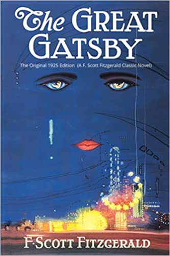 In envisioning your book cover design, color can’t be overlooked. Color weighs heavily into the success of photos and images in some of the most memorable book covers of the past. Easily coming to mind are the bright orange in the cover for A Clockwork Orange by Anthony Burgess, the black, made-up eyes and flaming red lips of a 1920s flapper against a blue sky backdrop for The Great Gatsby by Scott Fitzgerald, the black background against white lettering for the Godfather novel/blockbuster film by Mario Puzo and the shaded faces of The Invisible Man by Ralph Ellison.
Psychologists have long associated color with particular symbols and meanings. Some colors have even been assigned to particular genres and subgenres.
Color assignments based on genre are discussed in an article titled “How to Design a Book Cover: The 5 Elements of Best-Seller Cover Design” by Grace Fussell at https://www.shutterstock.com/blog/design and https://www.shutterstock.com/blog/complete-guide-color-in-design.
They prove especially effective in conveying specific moods or themes. For example, the black background of the 1970s Godfather novel suggests the darkness and danger of the criminal mobster underworld.
In another instance, the abstract brown, white and gray shadows of faces for the Invisible Man does speak to issues of race, skin color and invisibility in society before the start of the Civil Rights Movement.
Not only can color set the tone for the topic of your work, but it can be bold and dramatic enough in a book cover design to capture the attention and imaginations of readers. Feel free to widen your palette but be sure to choose well for the specific purposes of your book cover design.
For instance, Von Ness lauds the cover design of the book Never Tell Them: Bad Things Happen to Me by N.L. Hinkens for revealing the genre as psychological suspense thriller. In an online critique, he calls attention to the use of the color yellow for a young boy’s jacket and the light in his bedroom to inform the reader that all is not well with either one while the rest of the book is awash in different shades of blue.
Genre Adherence

Emily Bleeker’s The Waiting Room is another example of genre adherence for thrillers.
With the countless book titles that have been written and published since time memorial, some genres have come to be affiliated with certain types of colors, fonts, formats, images, and photos.
Namely, as soon as you view these elements in a book cover, you can readily identify the genre or subgenre or subject matter of the title itself. You must strike the balance between exercising some creativity and imagination and following the standard design elements reserved for particular genres or subgenres.
For example, red and black colors are connected to thrillers while powder blue covers are used to illustrate many works of period fiction.
In other words, do not stray too far from using standard design for your book covers, especially if you are a new author who has just begun to draw a following for your written work.
Don’t let your book title reflect one theme while your design elements completely express another. Don’t let your cover scream dystopian novel when you really mean madcap humor. You don’t want to confuse or drive your readers away.
A Convincing Cover Blurb
Aside from a title and an author’s name, increasingly, writers are adding cover blurbs to their covers to entice readers to explore the book’s interior. A cover blurb includes a brief description of your book’s topic and packs some intrigue. Consider including one in your book cover design. It gives you another chance to sell your readers by offering up the most interesting aspects or angle of your work or story.
Blurbs are typically used as background information. They can be found on the back cover of your book but can also appear one of the inner flaps of your dust jackets. Thankfully, they are never alone.
In fact, your blurb may be in good company. On your book cover, it may share space with other powerful marketing tools such as the excerpts of book reviews and your author bio. For instance, while he panned the book cover’s design, Von Ness stated in an online critique of the futuristic book Touching Habits by Richard G. Edwards that he was intrigued by its blurb and was tempted to read on.
The book’s storyline was inspired by the lockdown of the COVID-19 pandemic that began in March 2020 but its plot is set for the year 2220. The opening lines are as follows:
“What happens when physical distancing becomes the norm for society? When it is possible to download your consciousness into an android, when artificial intelligence gets bored, when babies are conceived and born in smart incubators, when the USA no longer exists? Welcome to 2220 … “
Fiction Cover Design Tips
Plotting your book cover design for a work of fiction takes serious thought and action.
Font Recommendations
First, you must adopt a consistent topography that is appropriate for your overall design. It needs to use no more than two fonts. The Helvetica and San Serif typeface families come highly recommended.
Secondly, try to keep from distracting your readership from the title. You should select a smaller size for your subtitle, which may appear over or under your book title. You could also place it between the lines as part of an experimental design.
If you are a new author who has not established your credentials with your base yet, your full name ought not be any bigger than your title.
Types of Images
You can locate your title, subtitle, and name to the left, right or central portion of your cover. However, the layout is the center of your design activity.
Thirdly, you do best to choose the right color scheme for your fictional cover. Shoot for an appealing contrast with, for example, three colors for your title, subtitle and author name.
Fourthly, when pondering imagery for your fictional cover, you will examine the best art or photos for your design objectives, a winning combination of graphics and an appropriate approach for your genre or subgenre.
In terms of subject matter, you can boast a number of choices for structuring your cover:
- a background scene with the main character or protagonist of your book;
- your hero or heroine at the top of the cover and a background scene below;
- a scene with the “also-ran” characters of your book;
- concentration on your protagonist’s face;
- minimalism;
- a floral motif, and;
- an emphasis on topography.
Any one of these choices can work well for your book cover design. It all depends on the subject or topic of your fictional work.
The Use of Layered Images, Shadows, and Glows
Fifthly, you can also opt to use layered imagery and shadows and glows for your covers. This comes from the use of software applications that help you achieve this, which we will address more fully in the Best Apps section of this article.
Layered images are most often used on photographs, which are considered to be part of a two-dimensional form—width and length.
Many designers find two-dimension graphics to be too limiting for their endeavors. They use layered images to achieve depth in their cover art and to create an illusion for viewers of their work. Depending on your objectives, you can too.
Similarly, designers resort to shadows and glows for the same reason: to also create depth in covers. Using both light and shade makes for a third dimension in cover art.
Nonfiction Cover Design Tips
Creating a nonfictional work does not mean that you cannot put in the same level of thought and planning into your book cover design as you would a fictional title. Don’t subscribe to this fallacy.
Having a graphic masterplan is just as important for your nonfiction cover design as it is for fiction.
The best approach is to think about the purpose of your nonfiction work: it is to teach the reader about a particular real-life subject or topic and boost your authority in that field.
In a sense, you are required to justify the existence of your book to readers among a sea of similar works.
Your primary goal is to place the most relevant information about your work front and center with your book cover design.
Don’t shy away from long titles and subtitles, play up your expertise or achievements, be sure to include blurbs from other authority figures and mention any accolades you’ve received for your work.
Overtime, after taking these steps above, you will have won over your readership and convinced them to forever trust you and your work.
Font Recommendations
Again, in choosing your typefaces, think about the nature of nonfiction. Nonfictional work calls for keeping your written content simple, to the point, clear and orderly. By extension, so must your book cover design.
To this end, you should choose plain and bold fonts and shun fancy typefaces as they will contradict your purpose to your readers. Be sure to restrict your cover art to two fonts that complement each other.
As will your overall book cover design, your font choices should reflect minimalism and, thus, make the most of the least of graphic material.
Against this backdrop, expert designers recommend the following no-nonsense typefaces for nonfiction book covers: American Typewriter, Casion, Criticized, Futura, Garamond, and Monserrat.
Colors
Since you will want to keep your book cover design for your nonfiction work simple and direct, you concentrate on choosing the right blend of colors.
Be pragmatic. You can select the main tone for your cover art for your title, subtitle, and author’s name.
Steer clear of bright hues, stress your message with a bright color and go for a subtle palette to establish an ideal mood for your book cover design. You can make a contrast between the title and subtitle with different colors. Or you can elect a dark background and light colors for your written content and mix dark type with a light background.
Feel free to use white space. Economy and control are key here.
Since the dawn of publishing and cover art, certain colors have come to be associated with particular moods and tones. For instance, yellow stands for happiness and well-being and can be used to illustrate a nonfiction work on self-help, motivational and health, and wellness themes. Orange radiates energy, being upbeat and having a rosy outlook on life and books that utilize such cover art reflect this in their written content. Blue communicates mental serenity and contemplation and is best used in cover art for memoirs and thoughtful fiction. Red conveys excitement and aggression such as, again, the red and black of psychological thriller books.
Minimalistic Design and Simplicity
In fact, given the nature and primary aim of your nonfiction work, which is to guide and instruct, you may even want to do without images and photos in your book cover design.
Aim for cover art that caters to cold reason. You can try an image at the center of your cover with an intriguing element that forces your readers to think. You can accomplish this with solid colors and plain fonts that stand out.
Just be sure to make use of the right combination of color, fonts, formats, layout, shades, and space to successfully communicate your mission and vision to your readership.
Best Apps to Use for Book Cover Designs
Apparently, with our modern publishing landscape and the digital age, you won’t be alone in making a statement to your readers about your work with your book cover design. As you are a wordsmith first and amateur cover designer second, you will need to rely on software applications to give life to your cover art.
Which software programs and mobile apps work best to communicate your book’s main premise to your readership? In the publishing industry, the top contenders are BookBrush, Canva, and the old and trusty standby Adobe Photoshop.
BookBrush
BookBrush is a handy tool for producing compelling book cover design and advertising. Its subscription plans are both free and at charge.
It empowers you with a wide collection of templates, images and fonts specifically designed for your genre and have three options for making three-dimensional and two-dimensional covers. Your resulting creations can be used for social media, email campaigns, and paid ads on such websites as BookBub.
Canva
Canva is a free graphic design program that is perfect for creating event invitations, business cards, and social media posts. Additionally, they have a series of eBook covers and a treasure trove of stock images and special effects that allow you to edit these visual elements for your cover art with ease.
Photoshop
Adobe Photoshop is the veteran of all design platforms. The program has more than 30 years of graphic art success in such projects as photography for newspaper layouts. While not specifically configured for book cover design, Photoshop still provides you with a reliable tool to crop, orient, change, or group photos, images and colors and includes such useful features as airbrushing to remove flaws.
Like BookBrush and Canva, it also offers a mobile app version of its program.
You don’t need a graphic design background to breathe life into your own book cover design (but it certainly helps). All you need is a firm grasp of the main ideas behind your work to be able to convey them visually. However, if the idea of designing your own book cover makes you nervous, you are not alone. There are a plethora of freelancers and services available to bring your cover’s vision to life.
But don’t trust your cover art to just any graphic service provider. Look at the reviews or portfolio of the designer first. Here are some of our latest cover designs.
Like what you see? Visit our Cover Design page to learn how we can create a masterpiece for the cover of your book.